Designing for the Open Economy: Our New Visual Identity
Today, we’re thrilled to unveil a new visual identity that brings to life our bold vision for the future of tokenization and the open economy.
In this post we wanted to talk a bit more about the thinking behind the new brand.
Logo
Before talking about what has changed, however, we did want to mention one thing that *hasn’*t: our logo. There are a few reasons for this. First, in talking to our stakeholders, we felt that the logo already had such strong brand recognition that changing it risked confusing our users. Second, given how much the other elements of our visual identity were changing, we wanted to provide some sense of continuity. Third, we all just already liked it. ‘Ondo‘ means ‘wave’ in Esperanto; this was both a reference to the fact that Nathan (our founder) was born in Hawaii, and an allusion to what we saw as the ‘coming wave’ of tokenization as assets move onto the blockchain.
Beyond our logo, however, many other aspects of our visual identity have been updated. Let’s take a look.
Photography
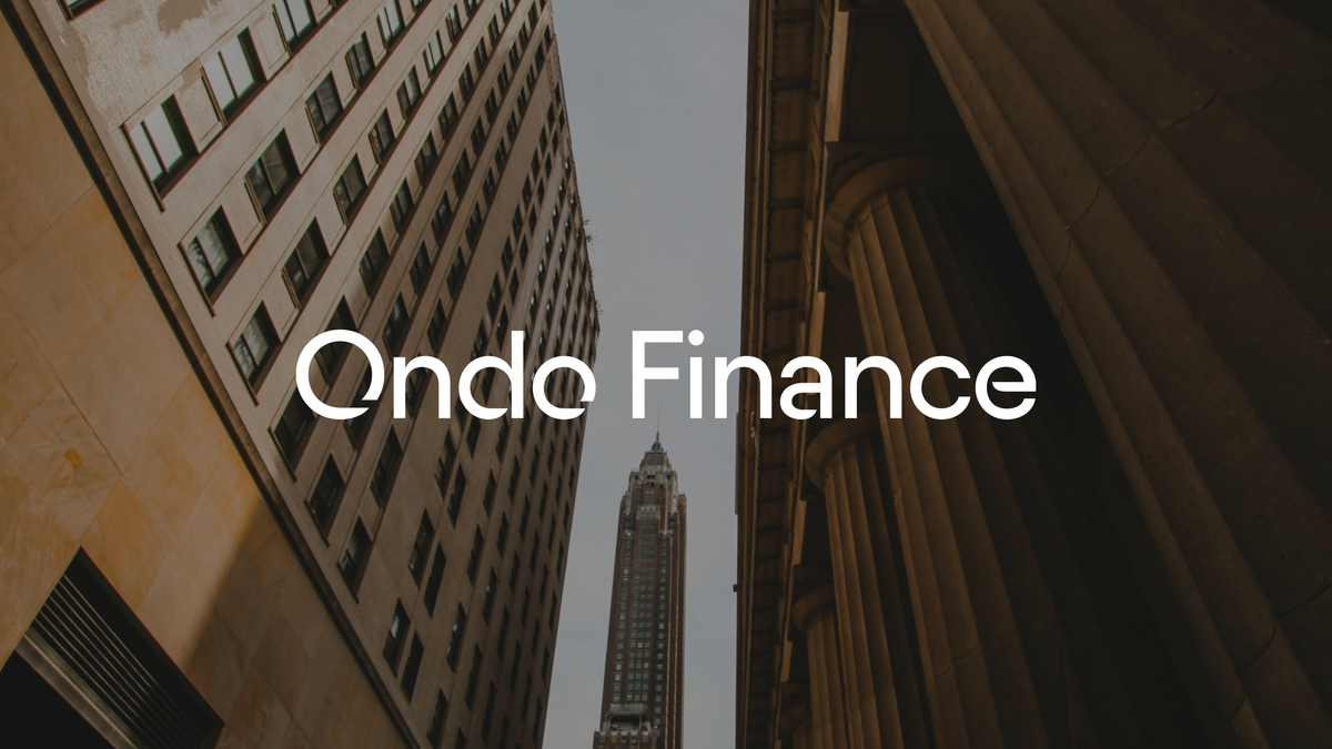
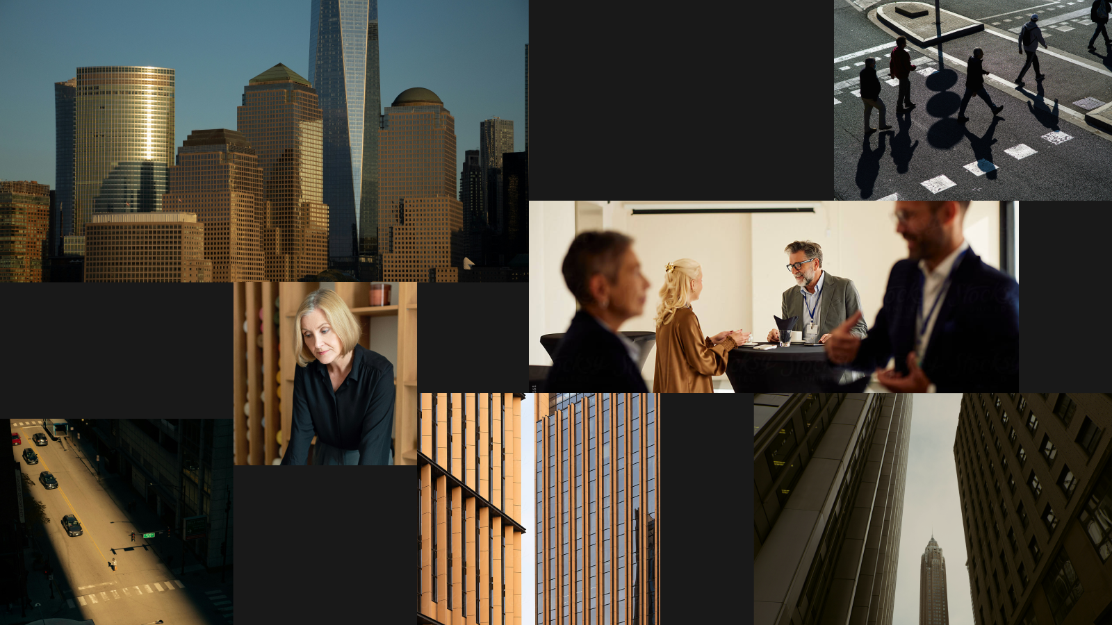
When you visit our new site, the first thing you’ll notice is that there is a lot more photography. As a company focused on bringing financial markets onchain—that is, connecting the real world to the blockchain one—we wanted to highlight more of this connection to the physical world and the people in it. Many blockchain companies’ websites are very ‘tech-y’ and abstract; while this may be appropriate for them, we ultimately see blockchain technology not as an end in its own right, but as a tool to help improve things in the real world for real people. For that reason, much of the photography you’ll see is of people. The other type of photography you’ll see frequently is of buildings and cityscapes, with a particular emphasis on shots that convey a sense of space. We did this to represent our emphasis on accelerating the transition to the open (i.e. space) economy (i.e. buildings, ports, people, etc.).
Graphics and Iconography
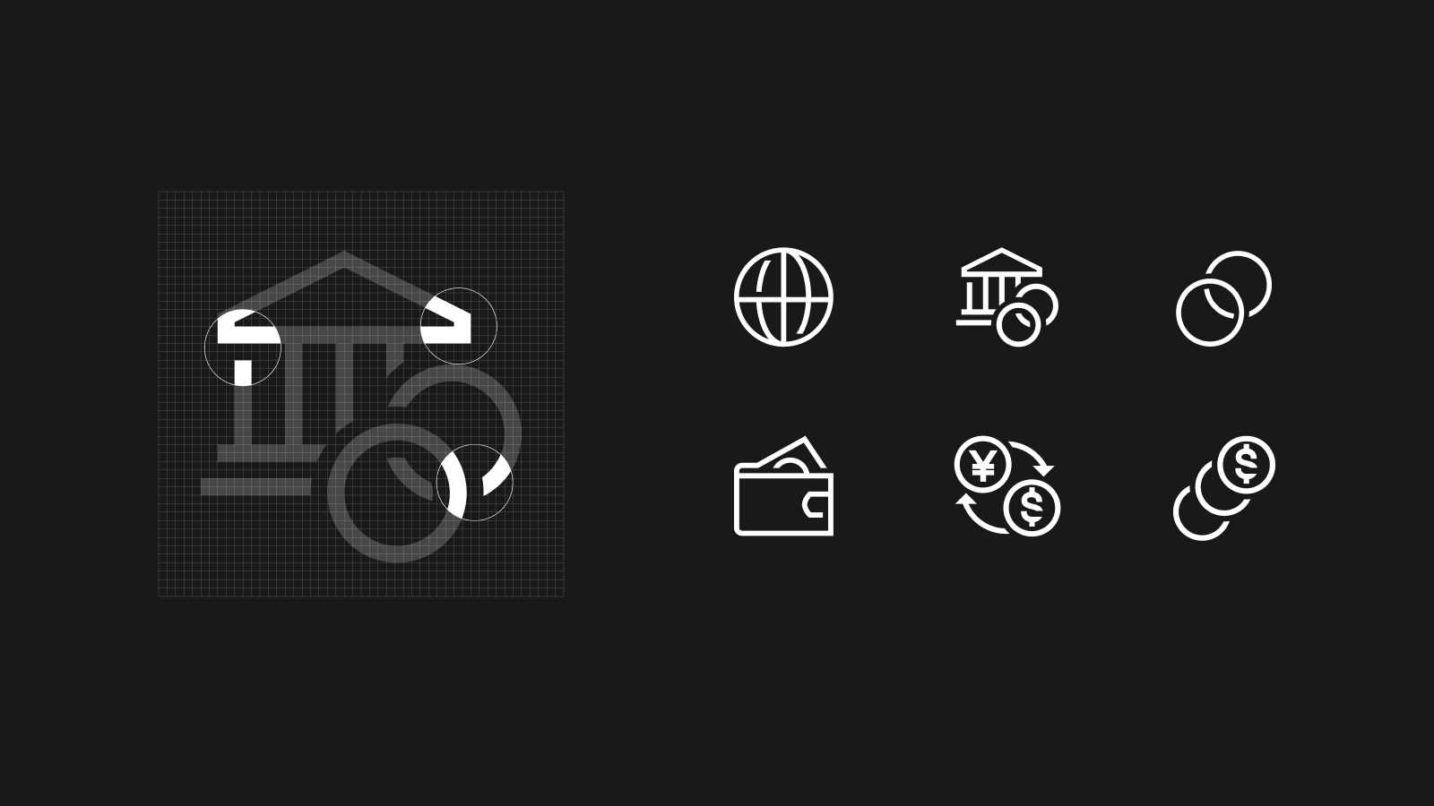
This is not to say that we exclusively use photography, however: we are trying to bridge the ‘real’ and ‘blockchain’ worlds after all. To that end, we do employ graphics where we think appropriate, particularly on pages or sections where we are talking more about technology. Even in our graphics and layouts, however, we’ve tried to use space where appropriate, creating a sense of openness.

We tried to do the same with our iconography. The simple line drawing style convey a sense of space and transparency while remaining reminiscent of our logo.
Typography
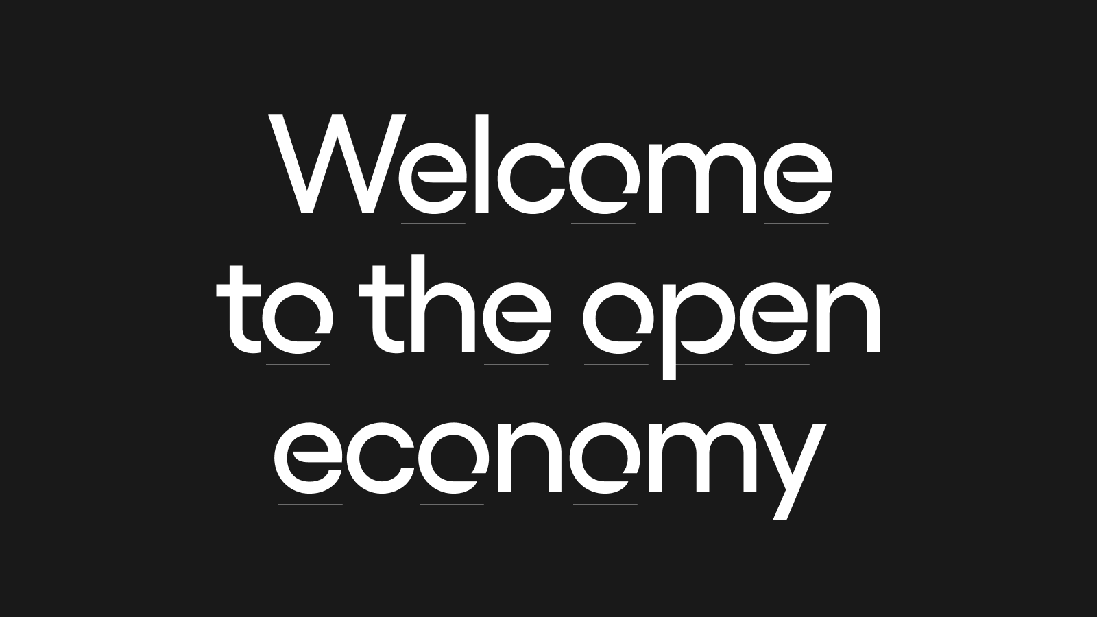
We continued this expression of openness into our logotype and typography through the creation of our own font, Ondo Sans:

The typeface is based on the Gelix family, but contains glyphs with breaks that that mirror openness of our logo. This is is most obvious with the ‘O’:
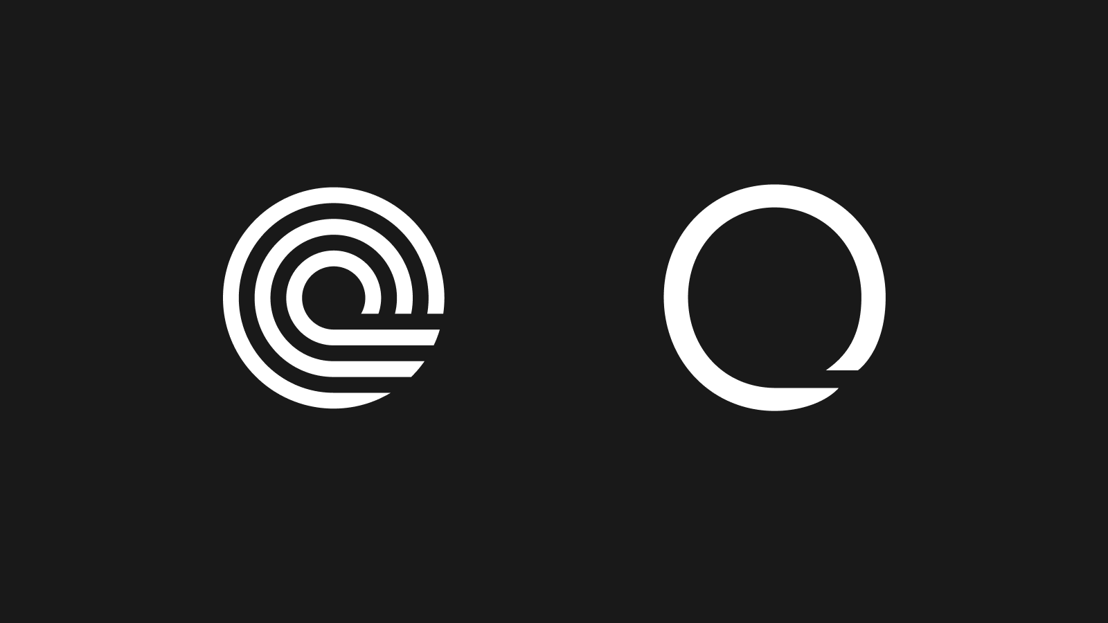
Each glyph in Ondo Sans was crafted to combine the trust conveyed by the sturdy construction of a sans serif typeface with the sense of openness and innovation. While overusing Ondo Sans glyphs could be overwhelming, we found that the right ratio balance readability and distinction. You will see the ‘open’ version of these letters and numbers used throughout the site at key moments to reinforce our brand.
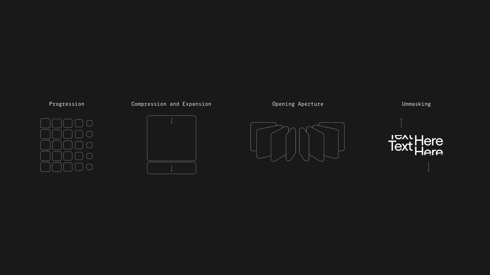
Animations
We started by aligning on a few key ‘themes’ for our animations that we felt would further reinforce this sense of openness: progression, compression and expansion, opening aperture, and unmasking. These motion principles are simple and versatile and can be applied to introducing content such as new partnerships, important statics, or animating in an image.
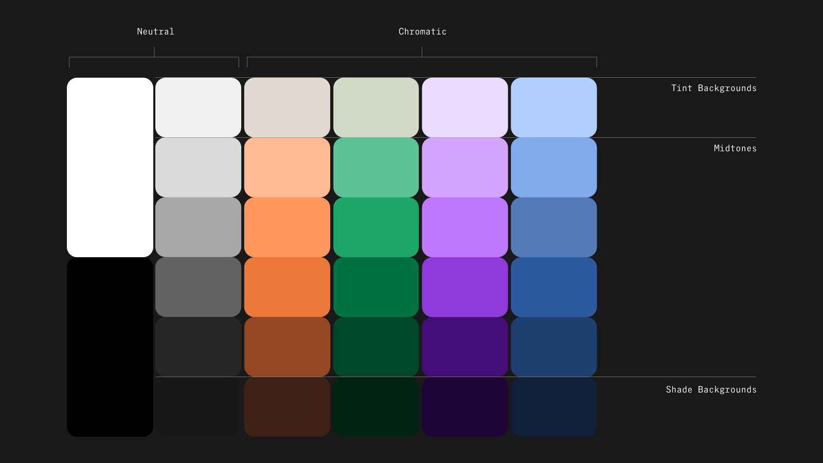
Color
In choosing a color palette, we wanted to covey being both modern and technically sophisticated with being grounded and focused on the impact we could have in the real world. We also wanted to balance professionalism (institutional-grade finance for everyone) with being friendly and approachable (institutional-grade finance for everyone).
We ultimately landed on a minimal but diverse color palette of deep and pop color tones that provides us versatility while still maintaining a sense of cohesion.
Designing for the Open Economy
Collectively, these changes align well with our mission of accelerating the transition to the open economy by building the platforms, assets, and infrastructure to bring financial markets onchain.
We really love our updated design. We hope you do too.